
Every January, a wave of web design trend lists appears, and most of them are the same collection of flashy ideas that no real business would ever use. Full-screen videos that crash on mobile, cursor trails that make text unreadable, and layouts that look stunning in a designer's portfolio but confuse actual customers. This is not that kind of list.
The trends below are the ones we are actually seeing work for clients in 2026. They are the ones that improve clarity, build trust, and make it easier for visitors to do what you want them to do. Some of them are subtle, and that is exactly the point. Good design in 2026 is less about impressing people and more about removing friction.

We have grouped these into ten clear points, from typography and layout to performance and accessibility. Some are technical, some are visual, but all of them have a direct impact on how visitors feel about your business when they land on your site.
If you are planning a redesign this year, treat this as a practical checklist rather than a trend report. Use what applies to your audience, ignore what does not, and always prioritise clarity over novelty.
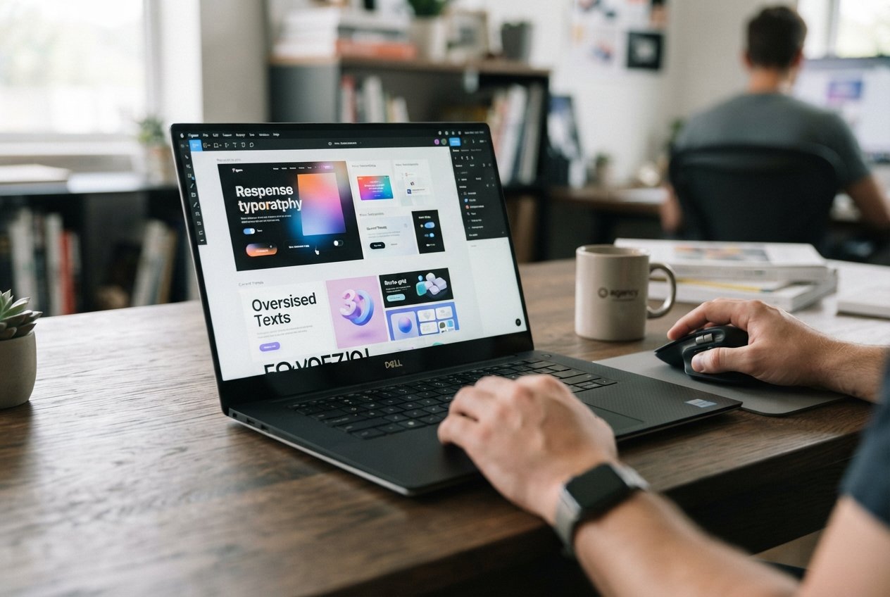
The biggest shift in 2026 is that type is getting larger and simpler. Headlines are bigger, line lengths are shorter, and there is more white space between elements. This is not just a style choice, it is a response to how people read on phones. Larger text with generous spacing is easier to scan, and easier to scan means more people actually read what you wrote.
Alongside this, there is a move back to fewer font families. Two fonts, used well, look stronger than five used carelessly. The most professional-looking sites we build in 2026 use one serif or geometric font for headings and one clean sans-serif for body text.
The asymmetric grid is everywhere this year. Instead of a rigid twelve-column layout, more sites are using intentional imbalance to draw attention to important content. A large heading on the left with a small block of supporting text on the right, or a hero image that bleeds off one edge of the screen. These layouts feel more editorial and less templated.
At the same time, sticky navigation is standard now, but only when it is subtle. A thin bar that appears when you scroll up, with just a logo and a menu, gives users a way back to navigation without cluttering the page. Anything heavier than that starts to feel intrusive.
In 2026, speed and accessibility are not technical afterthoughts, they are part of the design brief. Fast-loading pages with clear contrast, readable text and obvious focus states are the baseline. Designs that ignore this are increasingly seen as amateur, and they lose traffic because search engines and users both punish slow, hard-to-use sites.
The other big trend is honesty in design. Fewer gimmicks, fewer animations that exist just to show off, and more of a focus on making the content itself the star. The most memorable websites this year are the ones that feel calm, confident, and easy to use. That is the real trend worth following.
Your email address will not be published. Required fields are marked *
2026 © DevMorph. All rights reserved.